Baby Color Schemes for Nurseries (Calm, Modern & Timeless Palettes)
Baby color schemes shape how a nursery feels, photographs, and functions over time. The most successful baby color schemes use balanced contrast, soft warmth, and adaptable neutrals that work in 10x10 rooms, small nurseries, and larger baby spaces alike. This guide organizes baby color schemes by mood, flexibility, and long-term livability so you can choose a palette that looks beautiful now and still works years later.
Most nursery design mistakes begin with the wrong color foundation.
For ideas that focus specifically on how sage tones shape the look and feel of the walls, this sage green nursery wallpaper ideas page shows how pattern, texture, and tone work together in real spaces.
This page is part of the larger nursery ideas hub, where layout strategy, furniture sizing, storage planning, and color decisions are organized into one cohesive design framework.
Baby color schemes fall into five core directions: warm neutrals, soft pastels, sage & olive, gray & charcoal, and earth tones.
This guide focuses on palette structure rather than paint brand comparisons.
High-contrast palettes can completely shift the feel of a space, especially when the goal is a clean, modern look—these black and white nursery ideas show how to use contrast without making the room feel cold or stark.
What Is Your Ideal Nursery Color Scheme?
Tap the color direction that feels most like you.
See results for your ideal nursery color palette.
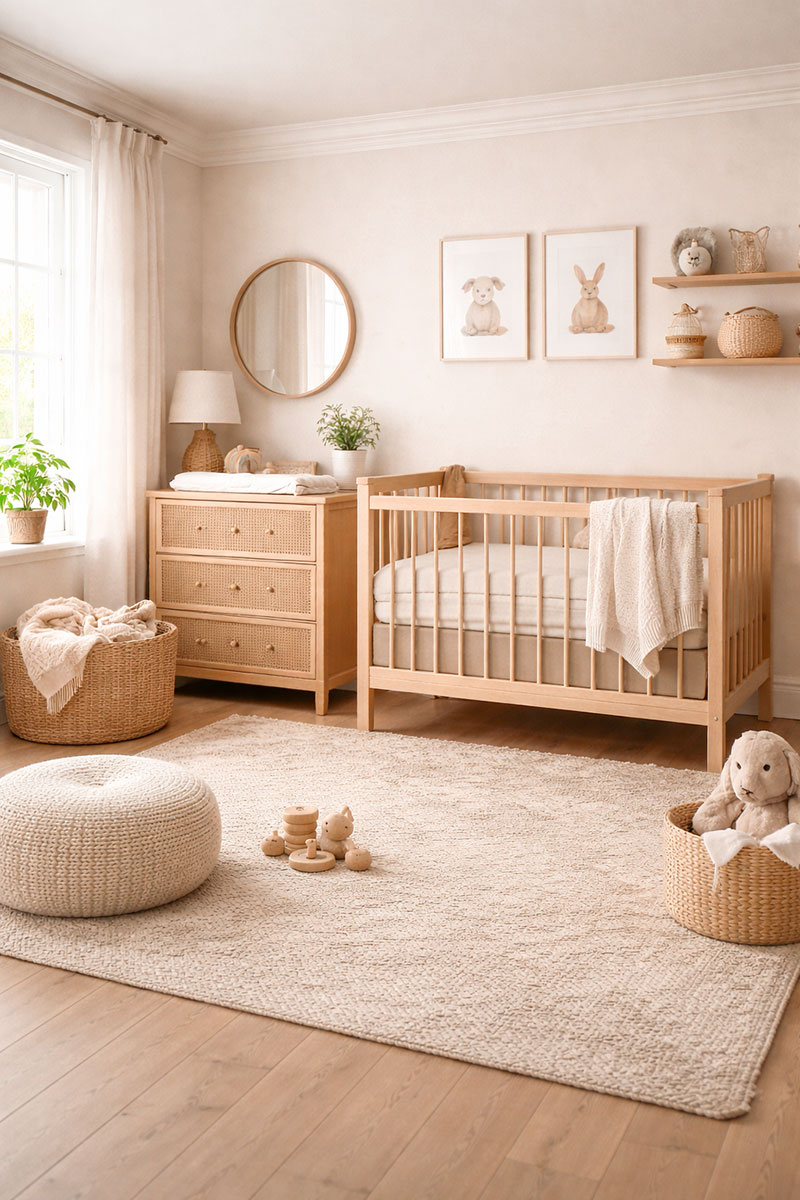
Warm Neutral Baby Color Schemes
Warm neutral baby color schemes rely on beige, cream, soft taupe, and natural wood tones to create calm, balanced spaces. These palettes work beautifully in small nurseries and grow seamlessly into toddler years. Texture—woven rugs, linen curtains, and light oak furniture—adds depth without overwhelming the room.
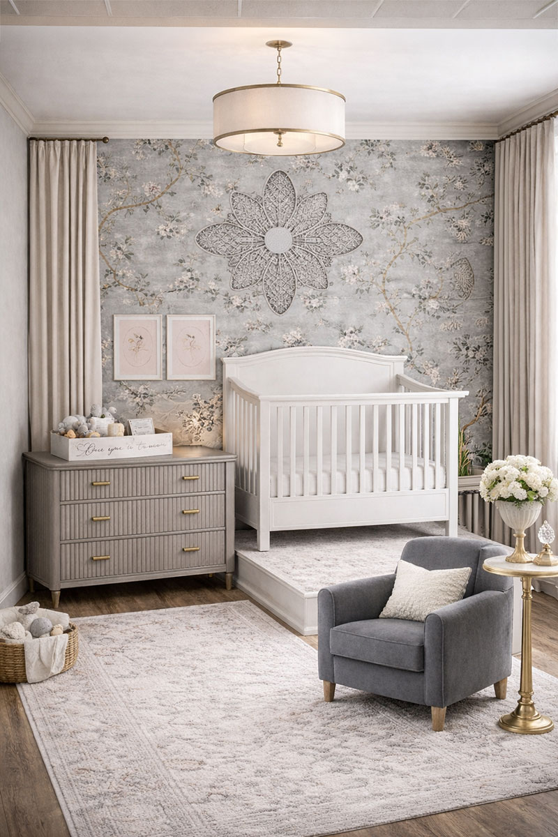
Soft Pastel Baby Color Schemes
Soft pastel baby color schemes use muted blush, dusty blue, pale lavender, and gentle mint to add personality without overpowering the space. Keeping furniture neutral allows pastel accents to shine while maintaining long-term flexibility.

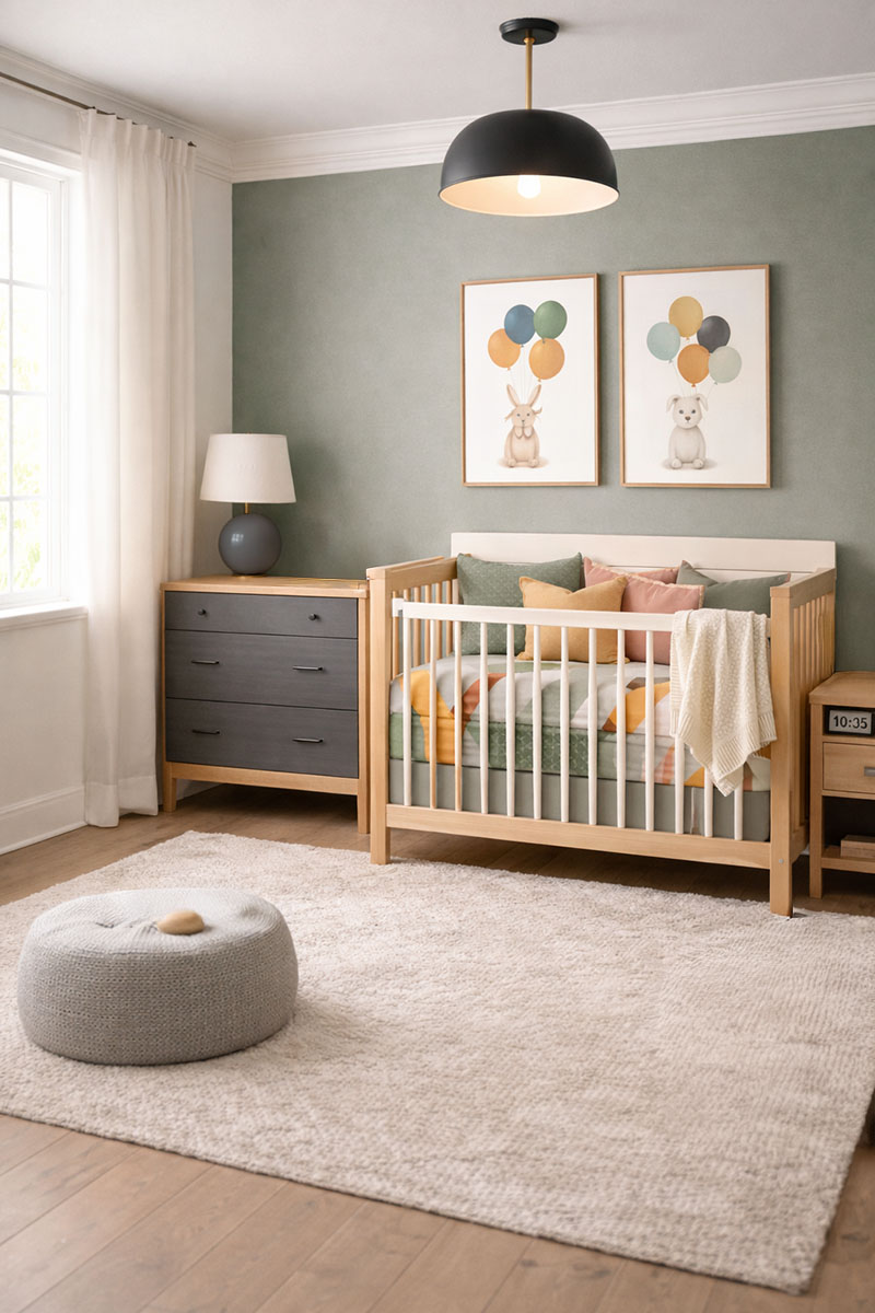
Sage Green Nursery Color Schemes
Sage green nursery color schemes create a soft, grounded atmosphere that feels both modern and timeless. Sage pairs beautifully with warm white, light oak, muted brass, and subtle charcoal accents for balanced contrast.
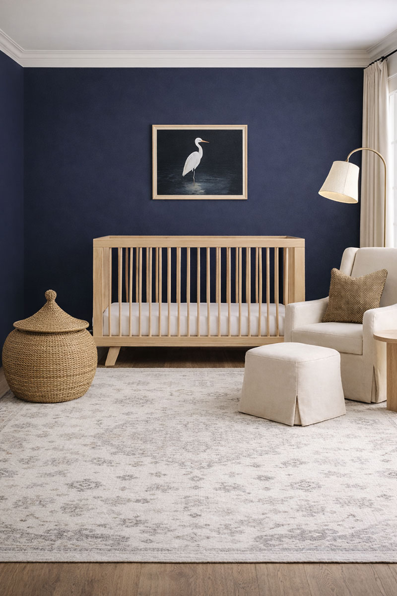
Modern Contrast Baby Color Schemes
Modern baby color schemes use charcoal, navy, clay, or matte black accents paired with warm white or cream to achieve clean, structured contrast. Limiting bold tones to focal elements keeps the nursery calm while still visually strong.
Go here to see modern nursery decor that fits contemporary color schemes
Gray & Charcoal Nursery Color Schemes
Gray and charcoal nursery color schemes are among the most adaptable and enduring foundations in modern nursery design. Soft gray walls create a light-reflective neutral base that works in 10x10 rooms, small nurseries, and larger open baby spaces.
For room-by-room placement guidance, see how gray performs in small spaces in this 10x10 nursery layout guide, where contrast and furniture positioning are shown in real floor plans.
Charcoal accents introduce structure and depth without overpowering the room.
The defining advantage of gray-based baby color schemes is structural flexibility. Lighting affects how gray and charcoal tones read from morning to evening, so this nursery lighting guide can help you keep the room feeling soft and balanced instead of flat or too dark.
Gray pairs naturally with warm white, brushed brass, matte black, light oak, walnut, muted sage, dusty blue, or soft blush, allowing the nursery to evolve without repainting. As bedding, artwork, and decor change over time, the gray foundation continues to work.
Charcoal should be used intentionally. Instead of painting all four walls dark, use charcoal in focused areas such as:
- A single accent wall behind the crib
- Fluted wood dresser painted deep gray
- Charcoal blackout curtains for contrast
- Framed artwork with black or dark wood trim
In smaller nurseries, contrast matters. A soft gray backdrop paired with a warm white crib increases visual clarity and helps the room feel brighter. If the nursery receives limited natural light, lean toward greige (gray with warm undertones) instead of cool blue-gray.
Many parents also prefer gray nursery color schemes because they photograph beautifully. Gray tones reduce color distortion in natural light, making milestone photos, newborn portraits, and everyday snapshots appear clean and timeless.
If you want to explore this palette in greater depth, see the full breakdown of layout ideas and gray styling combinations here: gray baby nursery ideas. That guide expands on furniture placement, contrast balance, and how to warm up a gray nursery without losing its modern edge.
When building a gray nursery color scheme, keep this formula in mind:
- 60% soft gray base
- 30% warm neutrals (cream, oatmeal, natural wood)
- 10% charcoal or deep accent
This proportion keeps the nursery calm, balanced, and visually grounded. Gray does not need to feel cold. Texture makes the difference. Add woven baskets, linen curtains, boucle gliders, ribbed dressers, and warm wood flooring to soften the palette.
Gray and charcoal nursery color schemes are especially effective for parents who want a design that transitions easily from baby to toddler to big kid. Instead of repainting, simply swap crib bedding for a toddler duvet, replace nursery art with framed prints, and keep the gray base intact.
Earth-Toned Nursery Color Schemes
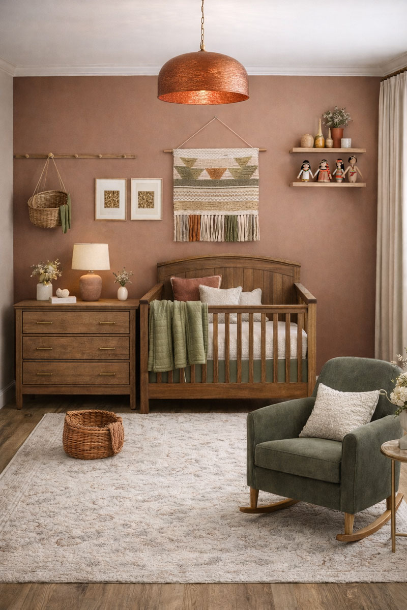
Earth-toned nursery color schemes center on terracotta, muted clay, olive, oatmeal, camel, and warm wood tones to create a grounded, organic atmosphere. These palettes balance warmth and softness, making them especially effective in light-filled nurseries.
Unlike cooler modern palettes, earth-toned baby color schemes rely on warmth. Clay-colored walls create a cozy backdrop. Olive textiles introduce contrast without sharpness. Oatmeal bedding softens the space and keeps it light. Warm walnut or oak furniture adds structure.
Earth-toned nursery color schemes perform best in rooms with strong natural light, where sunlight enhances clay and terracotta hues and prevents deeper tones from feeling heavy.
Sunlight enhances terracotta and clay hues, giving the nursery a gentle glow throughout the day. In north-facing rooms with cooler light, choose lighter clay shades instead of deep rust.
A balanced earth-tone nursery often includes:
- Muted clay or warm beige wall color
- Olive or sage textiles (blankets, cushions, curtains)
- Natural wood crib or fluted wood dresser
- Woven lighting such as rattan, hammered copper, or terracotta pendants
- Oatmeal or cream rug for softness
Texture plays a major role in earth-toned baby color schemes. Linen, cotton gauze, boucle, jute, wool, and unfinished wood create dimension without relying on bold patterns. The room feels layered rather than busy.
Earth palettes are also highly adaptable. Terracotta pairs well with blush for a softer look. Olive blends beautifully with charcoal for a more structured, modern approach. Clay tones complement brass, matte black, and brushed bronze hardware.
These baby color schemes are especially popular for gender-neutral nurseries because they avoid overly sweet or stereotypical tones while still feeling warm and welcoming.
When designing an earth-toned nursery, consider this simple structure:
- Warm mid-tone on walls (clay, camel, or warm beige)
- Light neutral anchor (oatmeal crib bedding, cream curtains)
- Two deeper grounding accents (olive + walnut or terracotta + bronze)
Earth-toned nursery color schemes create emotional warmth. The room feels calm but not flat. It feels styled but not overdesigned. This balance is what makes earth palettes increasingly popular in modern nursery planning.
If you prefer a more structured look, you can combine earth tones with soft gray or charcoal accents to introduce subtle contrast while preserving warmth.
Choosing a nursery color scheme is less about trend and more about structure, contrast balance, and long-term flexibility.
Baby Color Scheme FAQs
What are the best baby color schemes for a nursery?
The best baby color schemes usually start with warm neutrals, soft pastels, sage green, gray, charcoal, or earth tones. These palettes are flexible, photograph well, and can grow with the room over time.
What nursery colors work best in small rooms?
Small nurseries usually work best with warm white, cream, soft beige, pale sage, light gray, or muted pastels. These colors keep the room feeling open while still allowing contrast through furniture, rugs, and wall décor.
Are gray nursery color schemes still a good choice?
Gray nursery color schemes are still useful when they are warmed up with cream, oatmeal, wood tones, brass, sage, blush, or soft blue. The key is avoiding a cold all-gray room and adding texture for balance.
What baby color scheme grows best with a child?
Warm neutral, sage green, soft gray, and earth-toned nursery color schemes usually grow best with a child because the wall color and furniture can stay the same while bedding, artwork, and accessories change.


When you click on links to various merchants on this site and make a purchase, this can result in this site earning a commission. Affiliate programs and affiliations include, but are not limited to, Amazon and the eBay Partner Network such as the ones to your left on this page. Please see our Affiliate Disclosure page for more information.
More UBGI: RSS Feed | Facebook
About Jan | Contact | Baby Room Ideas (Blog) | Site Map | Privacy Policy | Disclaimer | Affiliate Disclosure | Earnings Disclosure
I am a participant in the Amazon Services LLC Associates Program, an affiliate advertising program designed to provide a means for us to earn fees by linking to Amazon.
Copyright © 2006-2026. All Rights Reserved.