Free Printable Letter Stencils A to Z
By Jan Bay
These free printable letter stencils give you a complete A to Z alphabet for names, signs, storage boxes, furniture, wall accents and other craft projects. Each bold block letter is designed as a true stencil with connected bridges where needed, so the centers of letters such as A, B, D, O, P, Q and R stay attached when you cut the stencil.
Explore More Free Printable Stencils
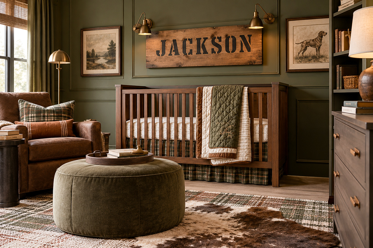
The room image shows one way stencil lettering can be used on a nursery name sign. The free A to Z download below uses the simpler block stencil alphabet in the printable files.
Reusable Stencil Sheets for Craft and Wall Projects
Jump to:
Download the A to Z Letter Stencils
How to Print and Resize the Letters
Download the Free Printable Letter Stencils A to Z
The complete set includes all 26 capital letters from A through Z in one simple block-stencil style. These are made as actual stencil letters, not ordinary alphabet outlines. Letters with enclosed centers use deliberate white bridges so those center pieces stay connected to the surrounding stencil material after the black areas are cut away.
At 100% print size, each letter is approximately 4 inches high. Every printable page also includes a 1-inch calibration square so you can check the scale before cutting your stencil material.
Download the Letter Stencil Files
The PDF contains one capital letter per US Letter page, measuring 8.5 by 11 inches. That is the easiest choice if you simply want to print a letter, trace it onto stencil film and start cutting.
The SVG set contains 26 individual scalable letter files. Each file is laid out on its own US Letter page with the calibration square and print notes included. I'd use the SVG version when you need to resize a letter in vector software before printing. These are printable vector pages rather than cutter-ready files for a craft machine.
The black portions of each design are the stencil openings you cut away. The white gaps you see across parts of A, B, D, O, P, Q and R are intentional. Do not cut those bridges away or the enclosed centers will no longer remain attached to the stencil sheet.
The printable files have been checked digitally for page size, letter height and the 1-inch calibration square. They have not been physically printed, hand-cut or paint-tested, so check the calibration square on your own printer before transferring a letter to stencil material.
How to Print and Resize the Letter Stencils
If you want the letters at their original size, open the PDF and choose 100% or Actual Size in the print settings. Avoid a setting such as Fit to Page when the finished measurement matters because the printer may reduce or enlarge the design.
Before cutting anything, measure the calibration square. At 100%, it should measure exactly 1 inch on each side. If it does not, correct the print setting and print that page again.
Here are the easiest sizes to work from:
| Print Scale | Approximate Letter Height | Useful For |
|---|---|---|
| 50% | 2 inches | Cards, tags and small craft projects |
| 75% | 3 inches | Storage boxes and smaller signs |
| 100% | 4 inches | Names, signs and furniture projects |
| 125% | 5 inches | Larger signs and wall accents |
If you're making a whole name or word, pick the finished height before you print every letter. A row of 3-inch letters can fit nicely on a storage box where 5-inch letters would feel crowded. On a wide wooden sign, the larger size may look better. Measure the project first. That's easier than trimming your idea down after the letters are already cut.
The SVG files give you more freedom because SVG is a vector format designed to scale. The W3C SVG specification explains how scalable vector graphics are built from vector shapes rather than depending on one fixed image resolution.
If you resize an SVG, measure the printed letter itself before cutting. The calibration square is 1 inch only when the page is printed at 100% scale. If you enlarge or reduce the entire SVG page, the square scales with the rest of the page.
How to Cut a Reusable Letter Stencil
You can make a quick one-use stencil from heavier paper or cardstock, but reusable stencil film makes more sense if you're painting a complete name, repeating initials or planning to use the alphabet again.
Materials
- Printed letter stencil or resized SVG printout
- Reusable stencil film or heavy cardstock
- Cutting mat
- Sharp craft knife
- Metal ruler for straight cuts where useful
- Low-tack painter's tape
- Pencil or fine removable marking tool
- Stencil brush or small foam pouncer
- Paint suitable for your project surface
- Scrap paper, cardboard or scrap material for a practice impression
1. Check the size first. Measure the printed calibration square and the letter itself before transferring anything. If the scale is wrong, fix it now. Do not try to compensate while cutting.
2. Transfer the letter. Secure the printed sheet beneath clear stencil film, or trace the design onto your stencil material. Leave plenty of uncut material around the outside of the letter. A narrow border around a large letter is harder to hold flat while you paint.
3. Identify the bridges. Look closely at A, B, D, O, P, Q and R before you make the first cut. The white openings that interrupt the black letter shape are part of the stencil construction. They connect the enclosed center to the rest of the stencil sheet.
4. Cut the black areas. Put the stencil on a cutting mat and work slowly with a sharp craft knife. Straight strokes can be guided with a metal ruler. Turn the stencil material instead of twisting your hand into an awkward angle around corners and curves.
The cutting step is an adult craft task. Craft knives are extremely sharp, so keep the knife, loose blades and freshly cut scraps away from children.
5. Check the narrow sections. Before pulling the cut pieces out completely, look at every bridge and thin edge. If one has become too narrow or nicked, reinforce or recut that area before using the stencil.
6. Make one practice impression. Tape the stencil to scrap paper, cardboard or a scrap of the same material as your final project. The practice piece tells you whether the stencil lies flat, whether you like the spacing around the letter and whether you're using too much paint.
Don't skip that little test just because the stencil looks right on paper. Cutting and painting are two different things.
How to Align Letters for a Name or Word
A good alphabet stencil is only half of a name sign. The other half is getting the letters straight and making the spacing look intentional.
Start by drawing or taping a very light horizontal baseline across the project. Measure from the same edge of the sign, box or furniture panel at both ends so the line itself is level.
Next, lay the printed letters out before you touch the paint. At the 4-inch size, I'd start with roughly 3/8 to 1/2 inch between neighboring letters and then adjust by eye. An I beside an L may need more space than an M beside an A. Equal measurements do not always look equally spaced.
If the word needs to be centered, measure the entire arranged word from its left edge to its right edge. Divide that measurement in half and mark the center. Match that point to the center of your sign or project area.
For a short name, you can tape all of the paper letters in position first. Then remove and stencil one at a time. That gives you a visual map and keeps the last letter from ending up squeezed against the edge.
For a longer word, mark the baseline plus a small pencil tick for the left edge of each letter. Keep the marks light enough to erase or cover later.
If you're using the same letter twice, let the first painted impression set enough that you won't smear it while repositioning the stencil nearby.
Keep the actual painting light. Load the stencil brush or foam pouncer, blot most of the paint onto scrap paper, then build the letter with light tapping rather than flooding the opening. Heavy wet paint is much more likely to creep under an edge.
Lift the stencil straight away from the surface rather than dragging it sideways. Check the back before moving to the next letter. If paint has reached the underside, wipe it clean before you continue.
For very long names, don't feel obligated to use the largest letters just because they fit vertically. A slightly smaller word with breathing room at both ends generally gives you more control over the layout.
Letter Stencil Project Ideas
The useful thing about keeping this alphabet plain is that it doesn't lock you into one decorating style. The same letters can look playful on a nursery storage box, rustic on a wooden sign or very simple on painted furniture.
Nursery name signs: Use the child's first name, initials or a short word on a painted wood or canvas sign. Choose the letter size after you know the width of the sign rather than trying to make a favorite size fit.
Storage boxes: A single large initial can be enough. If you're labeling several boxes, use the same letter height and baseline on all of them so the set looks related without becoming busy.
Furniture accents: One or two letters can personalize a drawer front, toy chest or side panel. I'd keep the rest of the piece simple and let the lettering do the work.
Seasonal signs: Because these are plain block letters, you can reuse the alphabet for fall, Halloween, Christmas, birthday and shower signs simply by changing the word and paint colors.
Canvas and handmade gifts: Initials work well when a full name would be too long for the available space. A monogram also gives you room to add another motif without crowding the project.
If letters aren't what you need for the next project, the free printable stencil patterns collection brings the site's stencil designs together in one place.
You can also pair lettering with a simple motif. The free flower stencils work well beside an initial or short name, while the free butterfly stencil gives you a larger decorative shape without changing the alphabet itself.
For a puppy-themed nursery or handmade sign, the puppy dog paw print stencil is another easy motif to use beside the block letters rather than trying to decorate the alphabet itself.
Tips for Clean Stenciled Letters
If the edges look fuzzy: Use less paint. Blot the brush or pouncer first and build the color in light applications. Also check that the stencil is lying flat against the surface.
If paint keeps collecting underneath: Clean and dry the back of the stencil before the next letter. A tiny smear on the underside can transfer to a project even when the front looks fine.
If a bridge looks too obvious: Paint the complete stencil first and let it dry. On a sign or decorative project, you can carefully touch in part of the bridge afterward with a small artist's brush if you want the finished letter to look more continuous. Do not cut the bridge out of a reusable stencil just to hide it.
If a word looks crooked: Stop before adding another letter. Recheck the baseline and the starting marks. A small error becomes much more noticeable once five or six letters follow it.
If the spacing feels wrong: Arrange the printed paper letters again before repainting anything. Look at the whole word rather than measuring every gap as though it has to be identical. Wide letters such as M and W change the visual rhythm.
If a letter is too large for the project: Reprint it smaller rather than trimming the outside of the stencil until there is almost nothing left to hold. The extra stencil material around a letter helps keep the sheet flat and gives you somewhere to tape it securely.
If you're not sure which size to choose: Print the letter on ordinary paper first and tape it temporarily to the project. Step back and look at the whole piece. Paper is cheap. Recutting a stencil because the first one was too small is the annoying part.
Once you have the size, alignment and paint amount worked out, keep those three things the same through the whole word. You don't need a complicated lettering system. You need a straight baseline, sensible spacing and a stencil that stays flat while you work.


When you click on links to various merchants on this site and make a purchase, this may result in this site earning a commission. This does not affect the price you pay.

UBGI Gold Standard 2026
Reviewed under the site's
editorial checklist.
About Jan | Contact | Baby Nursery Ideas (Blog) | Site Map | Privacy Policy | Disclosure Policy | Disclaimer | Affiliate Disclosure | Earnings Disclosure | Facebook | Pinterest
I am a participant in the Amazon Services LLC Associates Program, an affiliate advertising program designed to provide a means for us to earn fees by linking to Amazon. As an Amazon Associate I earn from qualifying purchases.
Copyright © 2006-2026. All Rights Reserved.