Baby Color Schemes for Nurseries (Modern & Timeless Paint and Pattern Ideas)
Baby color schemes can completely change how a nursery feels, photographs, and functions over time. The best nursery palettes balance warmth, contrast, lighting, and flexibility so the room still feels beautiful years later instead of trendy for only one season.
Most nursery design mistakes begin with the wrong color foundation.
Popular Nursery Color Ideas

See nursery decor, wall colors, rugs, lighting, and furniture that fit today's most popular baby color schemes.
Jump to Your Favorite Nursery Palette
Quick answer: The best baby color schemes start with one steady base color, one warmer balance color, and one darker or clearer accent. That mix keeps the nursery from looking flat in real life and helps the room photograph better in morning, afternoon, and lamp light.
A nursery palette can look perfect on a paint chip and still fall apart once the crib, curtains, rug, and wall pattern are in the same room.
I like baby color schemes that give the room somewhere to go later. A nursery changes fast. The crib becomes a toddler bed, the art changes, baskets get moved around, and the wall color suddenly has to work with bigger-kid bedding. That is why the strongest palettes are not the trendiest ones. They have a good foundation.
For the full decorating framework behind this page, my nursery ideas article connects color choices with layout, storage, furniture, lighting, and theme direction.
Color also affects how safe sleep spaces are photographed and understood online. When crib photos are used for nursery inspiration, I keep the sleep area visually simple and avoid showing loose bedding inside the crib. The U.S. Consumer Product Safety Commission safe sleep guidance is a good reference for keeping the crib itself clear.
Warm Neutral Baby Color Schemes That Age Well
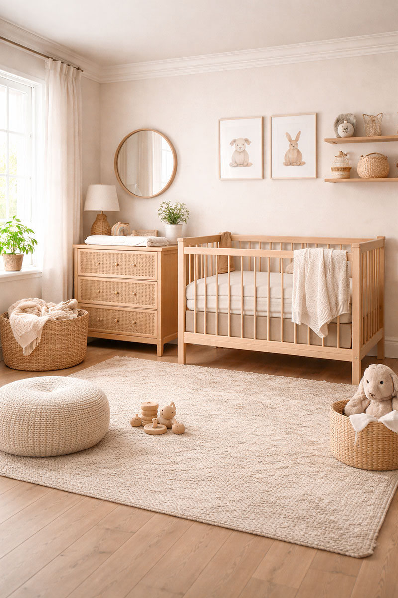
Warm neutral baby color schemes are the easiest place to begin when the room has to stay flexible. Beige, cream, taupe, oatmeal, light oak, and aged brass can handle almost any nursery theme you add later. The room still has shape, but nothing fights for attention.
I notice this most in smaller nurseries where every piece of furniture is visible at once. A beige wall, cream rug, and natural wood crib can make the room look intentional even before the art and shelves are finished.
A good warm neutral formula is cream walls, beige or taupe textiles, light wood furniture, and one grounding accent such as antique brass, walnut, or matte black. That last accent matters. Without it, a neutral nursery can look unfinished rather than relaxed.
For rooms that need more light planning, pair this section with my nursery lighting ideas. Neutral walls change quickly under yellow bulbs, cool LEDs, and shaded windows.
Browse nursery decor that works with warm neutral color schemes
Pastel Baby Color Schemes Without the Candy Look
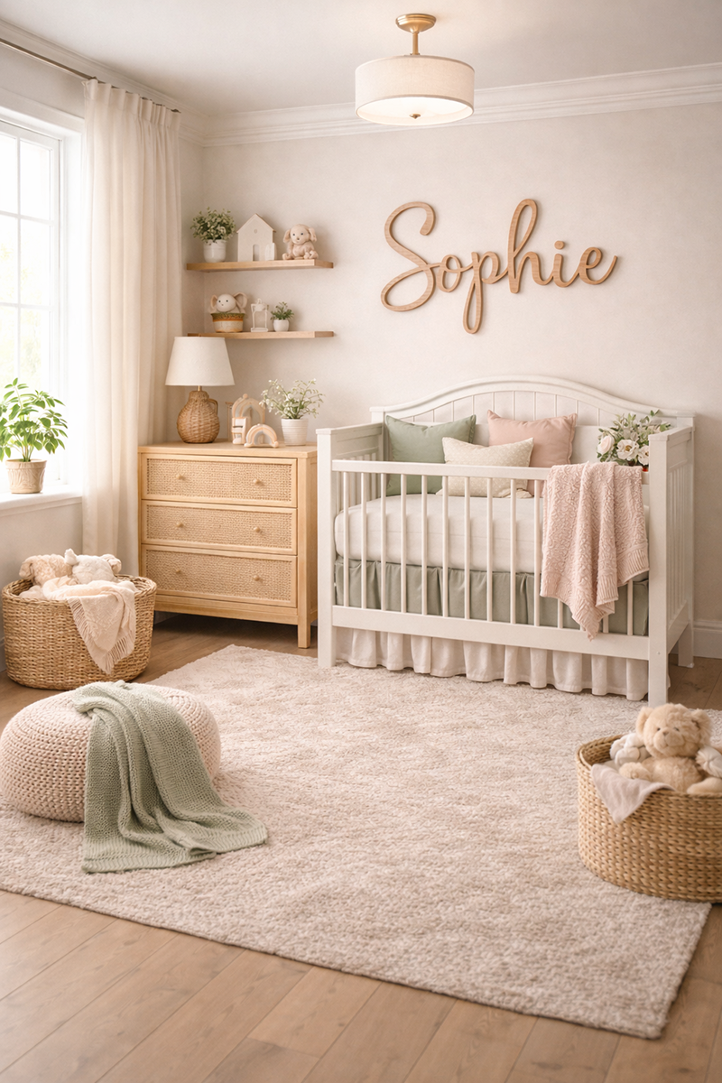
Pastel baby color schemes work best when the color has a little dust in it. Blush, muted lavender, faded blue, pale mint, and gentle peach look more grown-up when they are paired with cream, camel, light oak, or woven texture.
The mistake is choosing every item in the same pastel shade. A blush wall, blush rug, blush curtains, and blush bedding can flatten the room fast. The better move is to let one pastel lead and let the rest of the room support it.
Dusty blue and oatmeal is one of the most useful pastel combinations because the blue gives the room color while the oatmeal keeps it from reading cold. Blush and camel work the same way. Lavender looks better with warm white than bright white.
For a pink direction that still looks refined, my pink baby nursery ideas page gives more room examples without turning the whole space into one shade.
Sage Green Nursery Color Schemes With Pattern
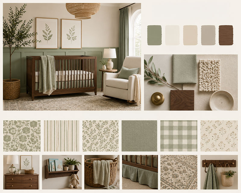
Sage green nursery color schemes are popular because they sit between color and neutral. Sage can read earthy, classic, vintage, or modern depending on what sits beside it.
I believe sage looks strongest when it is not treated like a theme by itself. It needs a partner. Walnut makes it richer. Oatmeal makes it quieter. Charcoal gives it structure. Brass adds polish without making the room shiny.
Pattern is where sage gets interesting. A sage wallpaper, leafy fabric, small-scale stripe, or washed botanical print can add depth without turning the nursery into a busy wall. If the room is small, keep the pattern behind the crib or above a dresser instead of wrapping every wall.
For more pattern-based examples, see my sage green nursery wallpaper ideas. That page goes deeper into wall treatments, scale, and how sage changes beside cream, oak, and darker trim.
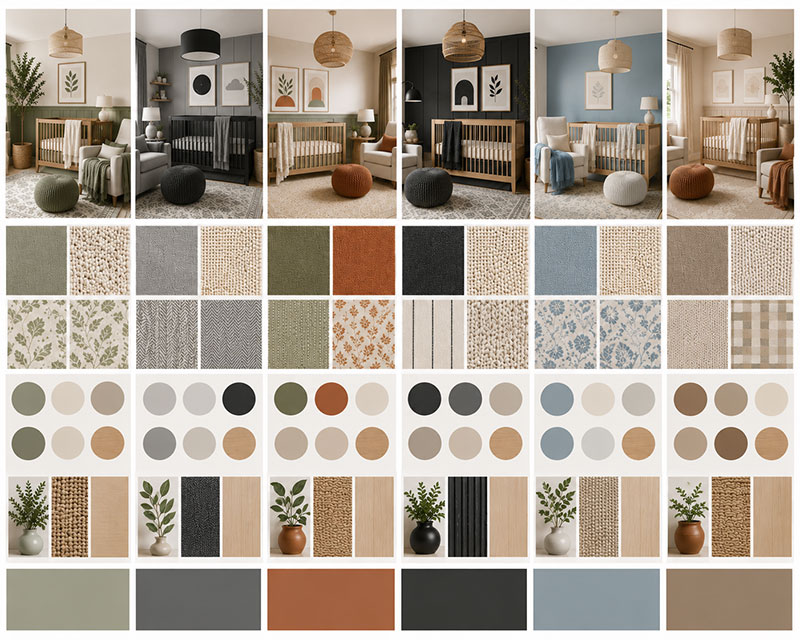
Modern Baby Color Schemes With Better Contrast
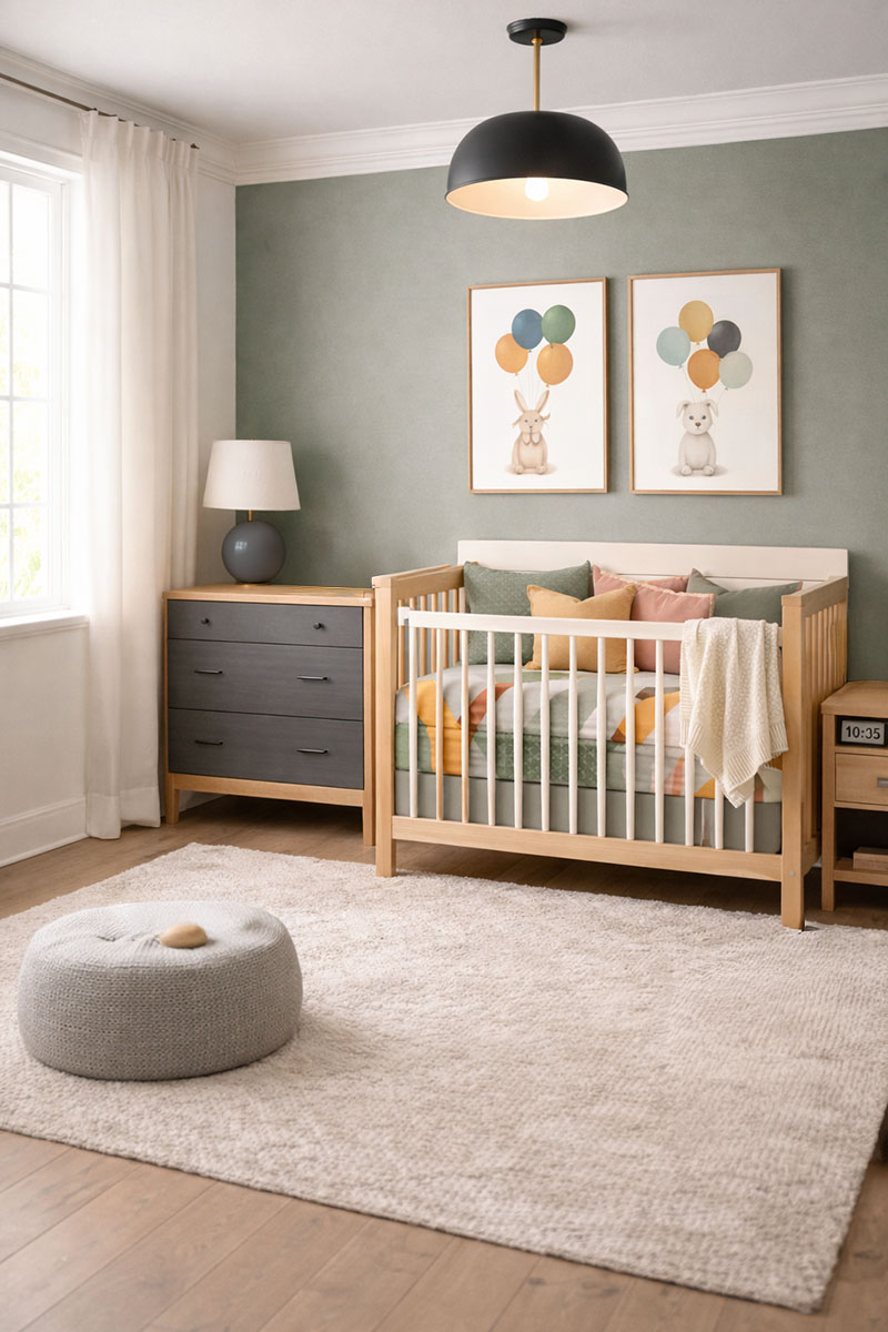
Modern baby color schemes need contrast, but not too much of it. A room with only pale colors can look washed out. A room with too many dark accents can look heavy. The best middle ground is a light base, a clear accent, and one natural material to break up the sharp edges.
Black, navy, charcoal, deep olive, or clay can all work as the darker note. The trick is to repeat that color in small places, such as a picture frame, lamp, curtain rod, dresser knob, or patterned rug.
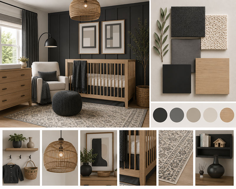
Charcoal and oak is especially good when the nursery already has a lot of white. The oak keeps the space from looking stark, while charcoal gives the eye a place to land.
If you want a bolder version of this idea, my black and white nursery ideas page shows how to use high contrast without making the nursery look cold.
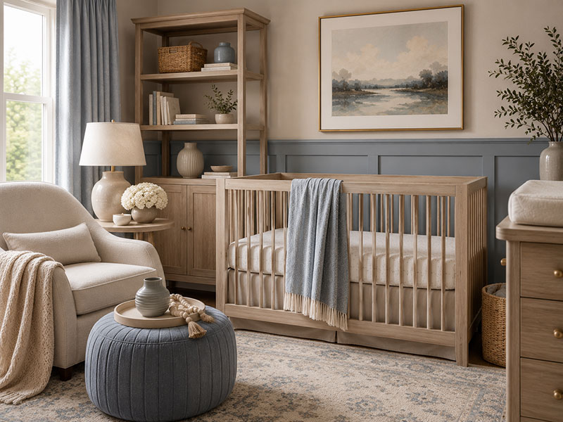
Gray Nursery Color Schemes That Still Look Warm
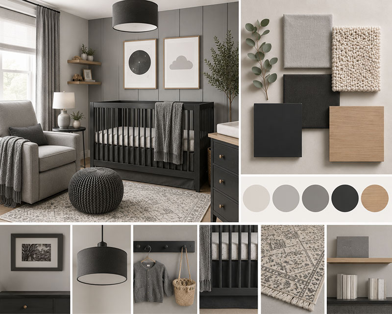
Gray nursery color schemes still work when the gray has warmth, texture, and contrast around it. A cool blue-gray can look flat in a dim room, but greige, mushroom, pewter, and warm light gray are much easier to live with.
Gray is not the problem. Empty gray is the problem.
Use gray as the base, then bring in cream curtains, natural wood, brass, oatmeal fabric, or a muted color such as sage or dusty blue. That keeps the nursery from looking like an office with a crib in it.
Gray is also a useful choice for shared rooms and small layouts because it lets the furniture lines show clearly. For furniture placement help, see my 10x10 nursery layout guide.
For a full gray-focused room plan, go to my gray baby nursery ideas page.
Earth-Toned Nursery Color Schemes With Depth
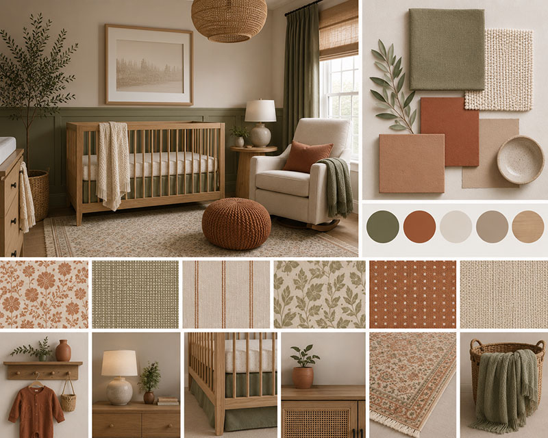
Earth-toned baby color schemes bring together terracotta, clay, olive, camel, oatmeal, walnut, and muted rust. These colors can make a nursery look collected instead of newly bought all at once.
The key is not using every earth tone equally. Pick one main color, one lighter balance color, and one deeper accent. Clay walls, oatmeal curtains, and olive textiles are enough. Add walnut or bronze only where the room needs a little weight.
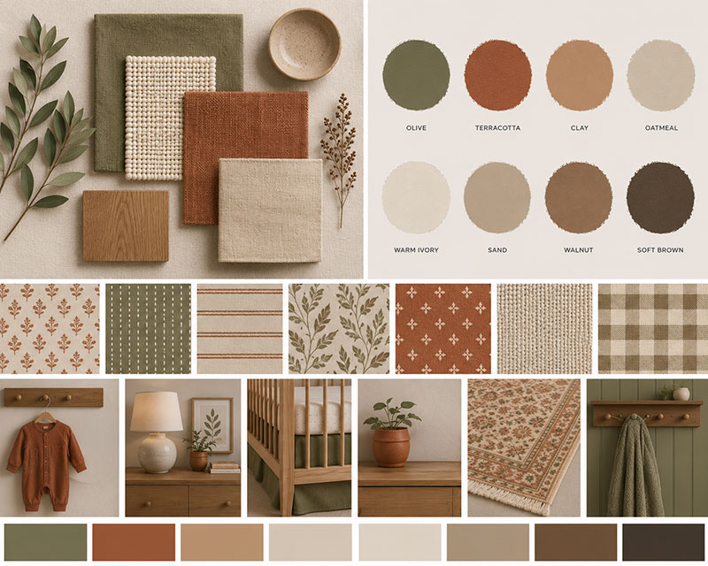
Earth colors look different depending on the direction of the window. Clay can look rich in late-day sun and muddy in a darker corner. Olive can look elegant beside cream and dull beside bright white. Testing fabric, paint, and wood together matters more here than it does with simple neutrals.
These palettes are especially useful for gender-neutral rooms because they avoid the predictable pink-or-blue split while still giving the nursery personality.
Baby Color Scheme Formulas Worth Saving
When a nursery palette is hard to choose, use a simple formula instead of starting with a theme. This keeps the room from drifting into random purchases.
- Warm neutral formula: cream walls, beige textiles, light oak furniture, brass accent.
- Sage formula: sage wall or wallpaper, oatmeal fabric, walnut wood, warm white trim.
- Pastel formula: one muted pastel, cream furniture, camel or oak accent, small patterned detail.
- Modern contrast formula: warm white base, charcoal or navy accent, oak or walnut balance.
- Earth tone formula: clay or terracotta base, oatmeal lightener, olive or bronze accent.
My favorite test is simple. Put the crib finish, curtain fabric, rug color, and wall sample beside each other in daylight. Then look again at night with the lamp on. If the colors still belong together in both moments, the palette has a much better chance of working long term.
Baby Color Scheme FAQs
What are the best baby color schemes for nurseries?
The best baby color schemes for nurseries include warm neutrals, sage green, muted pastels, gray with warm accents, modern contrast palettes, and earth tones. The strongest nursery palettes use a base color, a balancing color, and one accent so the room has structure without looking busy.
What nursery color scheme works best in a small room?
Small nurseries often work best with cream, warm white, beige, light greige, pale sage, or dusty blue. Add contrast through the crib finish, picture frames, curtains, or a rug rather than using too many strong wall colors.
Are sage green nursery color schemes still popular?
Sage green nursery color schemes remain popular because sage works with warm wood, cream, oatmeal, charcoal, brass, and wallpaper patterns. It can lean modern, vintage, woodland, or gender-neutral depending on the surrounding materials.
How do I choose nursery colors that will last?
Choose a wall color and furniture finish you can live with for several years, then use art, bedding, rugs, and curtains for the easier-to-change colors. Warm neutrals, sage, greige, dusty blue, clay, and oatmeal tend to age better than very bright trend colors.
Choosing baby color schemes is not just about picking pretty paint. It is about building a nursery palette that works with the light, the furniture, the crib, the wall pattern, and the way the room will change as your baby grows.


When you click on links to various merchants on this site and make a purchase, this can result in this site earning a commission. Affiliate programs and affiliations include, but are not limited to, Amazon and the eBay Partner Network such as the ones to your left on this page. Please see our Affiliate Disclosure page for more information.
More UBGI: RSS Feed | Facebook
About Jan | Contact | Baby Room Ideas (Blog) | Site Map | Privacy Policy | Disclosure Policy | Disclaimer | Affiliate Disclosure | Earnings Disclosure | Facebook | Pinterest
I am a participant in the Amazon Services LLC Associates Program, an affiliate advertising program designed to provide a means for us to earn fees by linking to Amazon.
Copyright © 2006-2026. All Rights Reserved.